Wraxall Builders Rebrand
The Project:
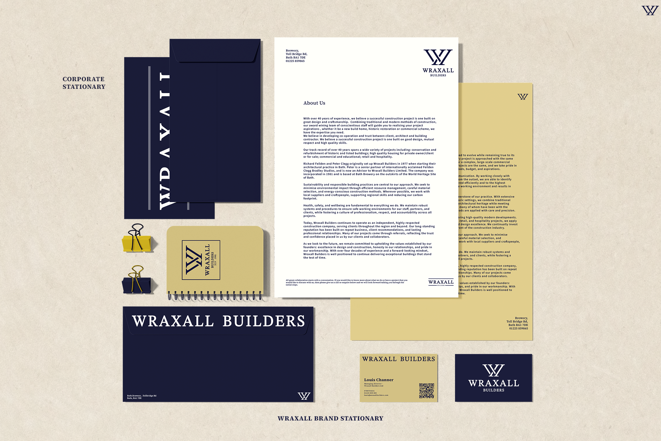
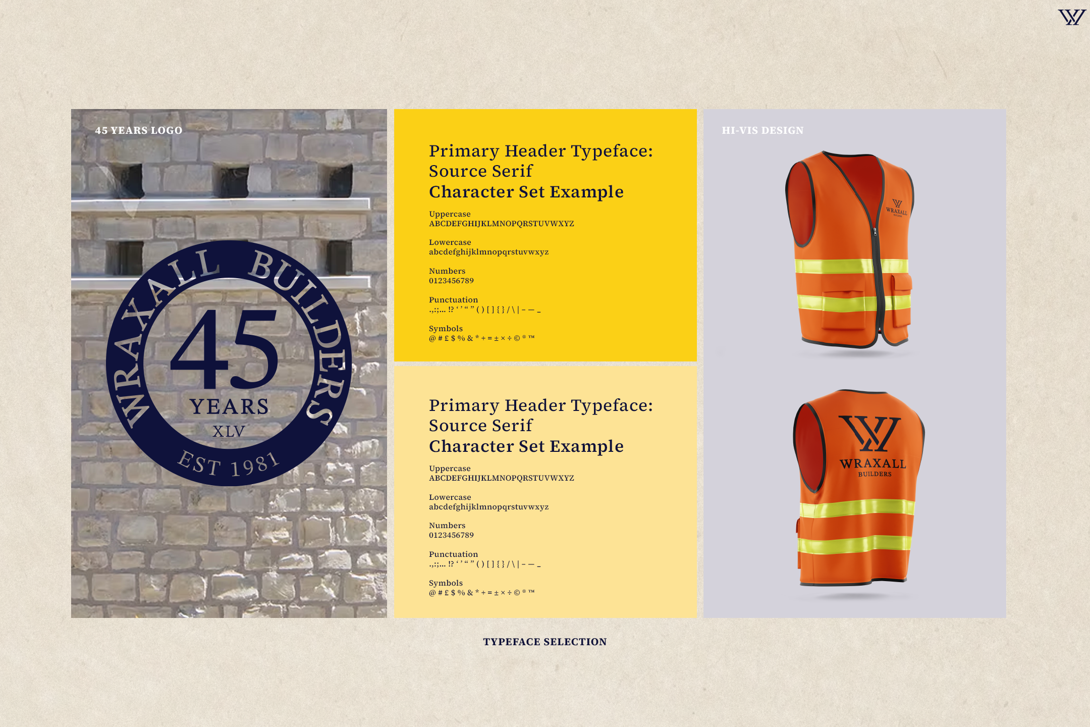
Wraxall Builders is a long-established construction company with a 45-year legacy built on craftsmanship, reliability, and trust. Approaching a significant anniversary, the business sought to refresh its brand identity to reflect its experience and professionalism while ensuring it remained relevant and adaptable for the future. The rebrand needed to honour the company’s heritage while introducing a more contemporary, confident visual presence across both traditional and digital applications.
Check out the rest of the project below
Rationale:
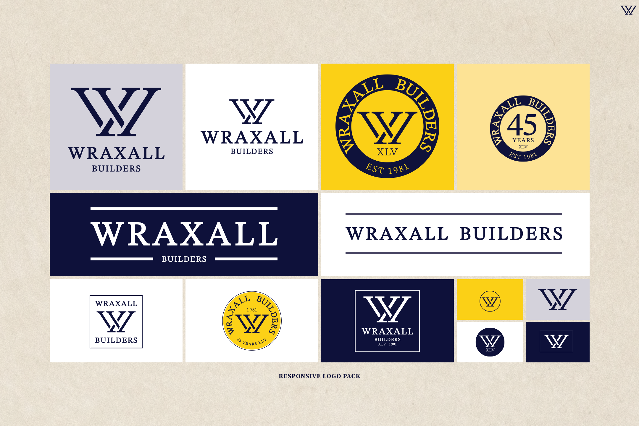
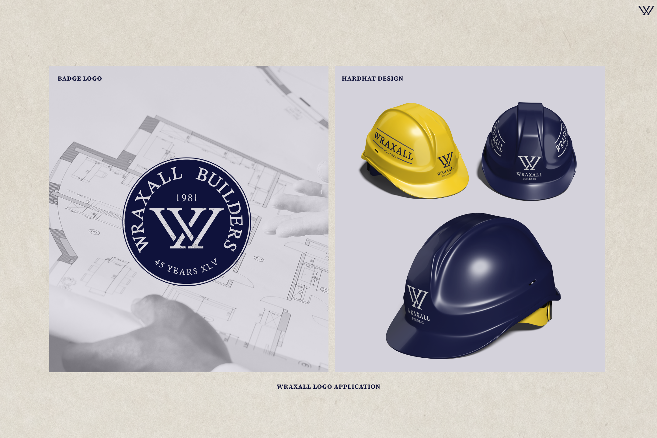
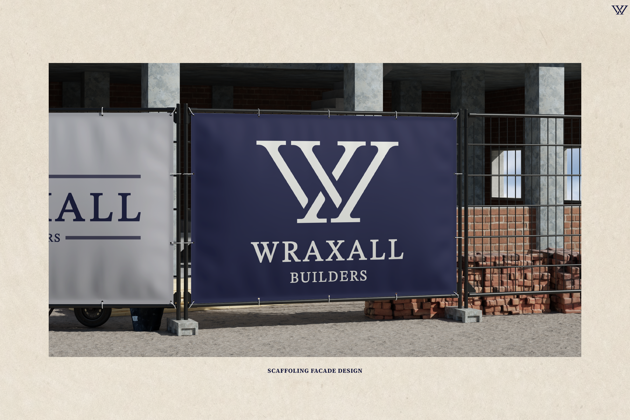
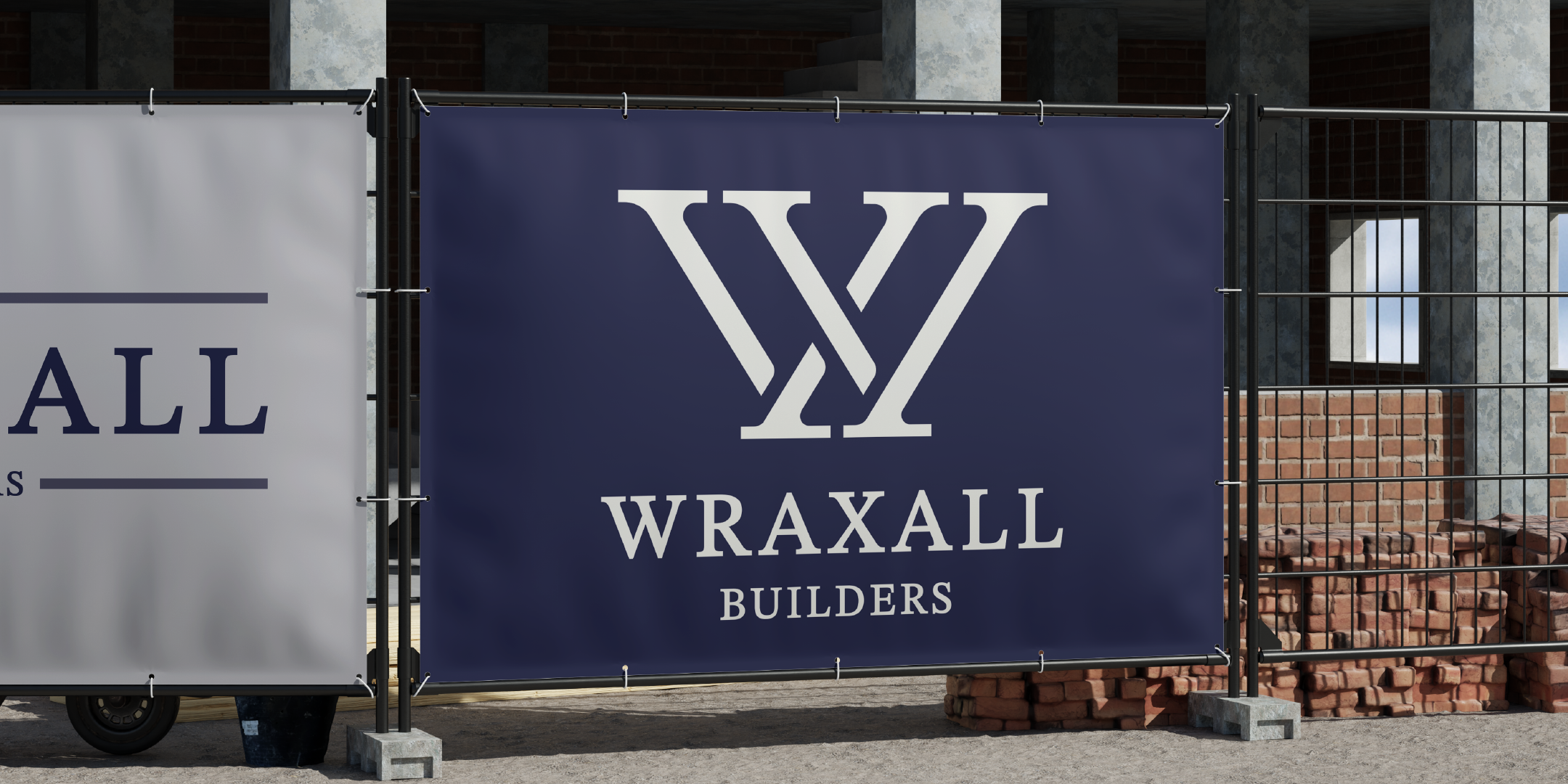
The rebranding of Wraxall Builders was rooted in respect for the company’s longevity and reputation, balanced with a forward-looking approach. I began by exploring mature, authoritative typefaces that conveyed stability and experience. By analysing and refining the inner structure of the chosen typeface, I developed a distinctive icon derived from its core forms, creating a visual mark that feels both familiar and uniquely ownable.
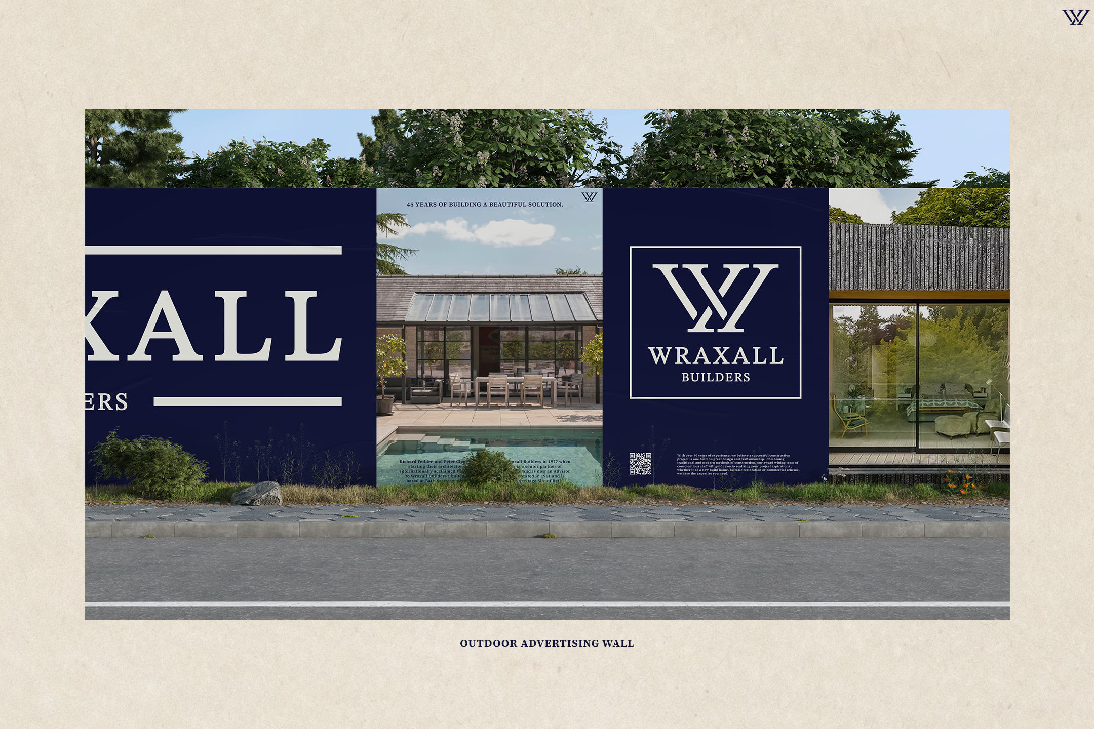
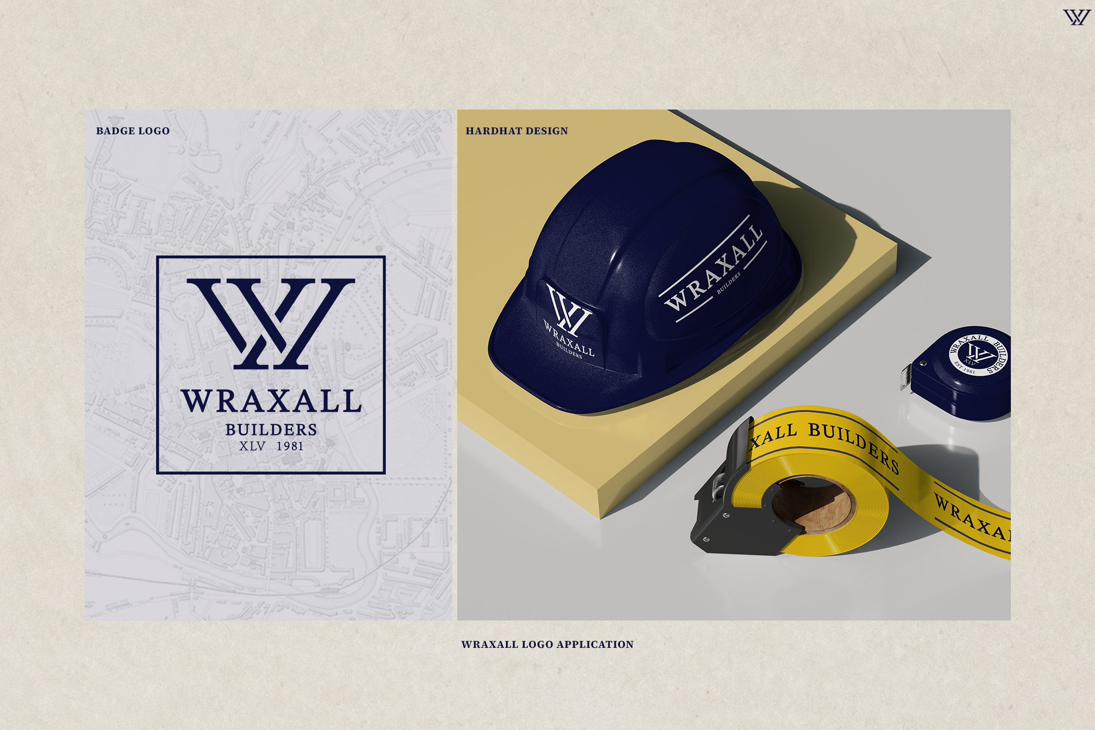
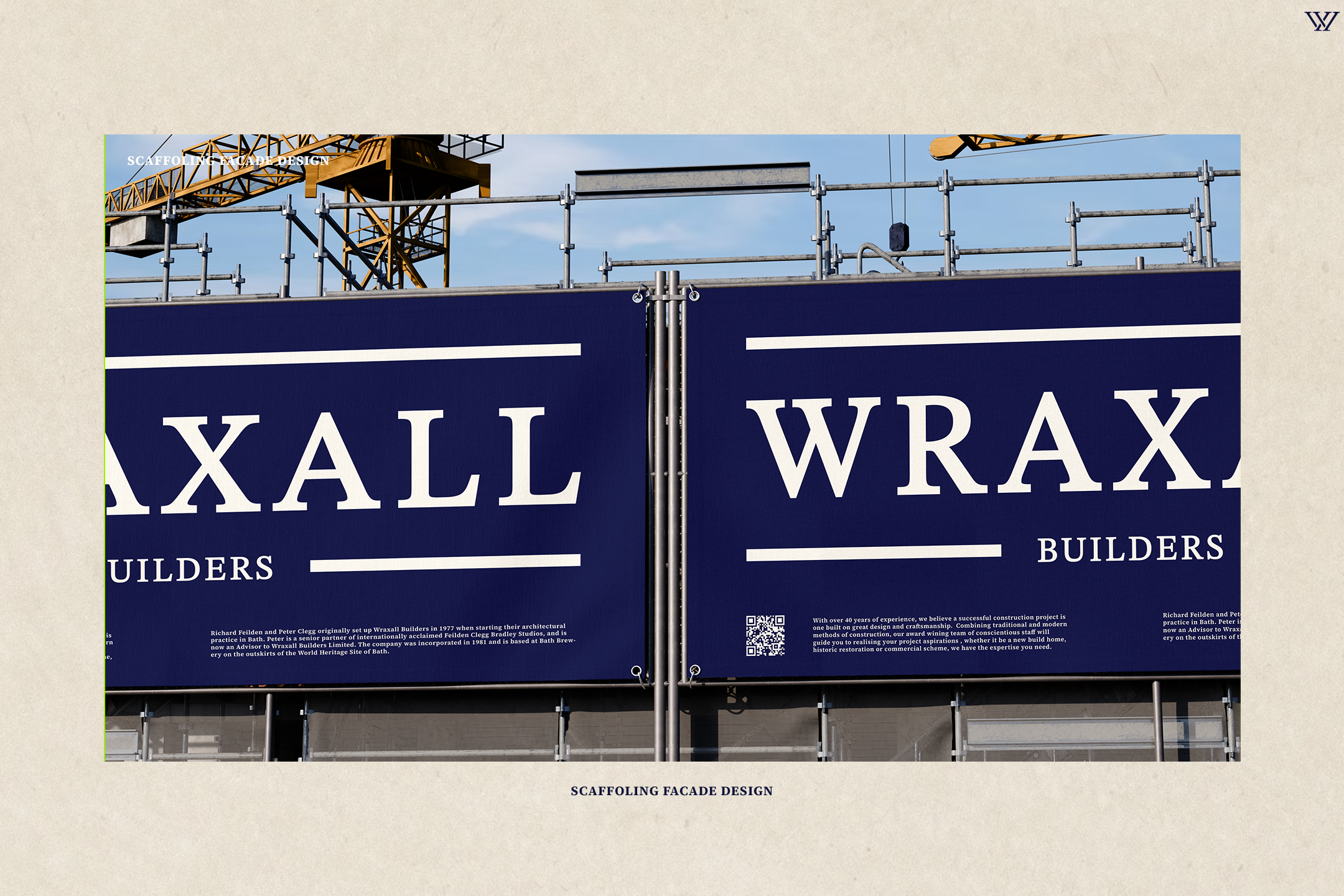
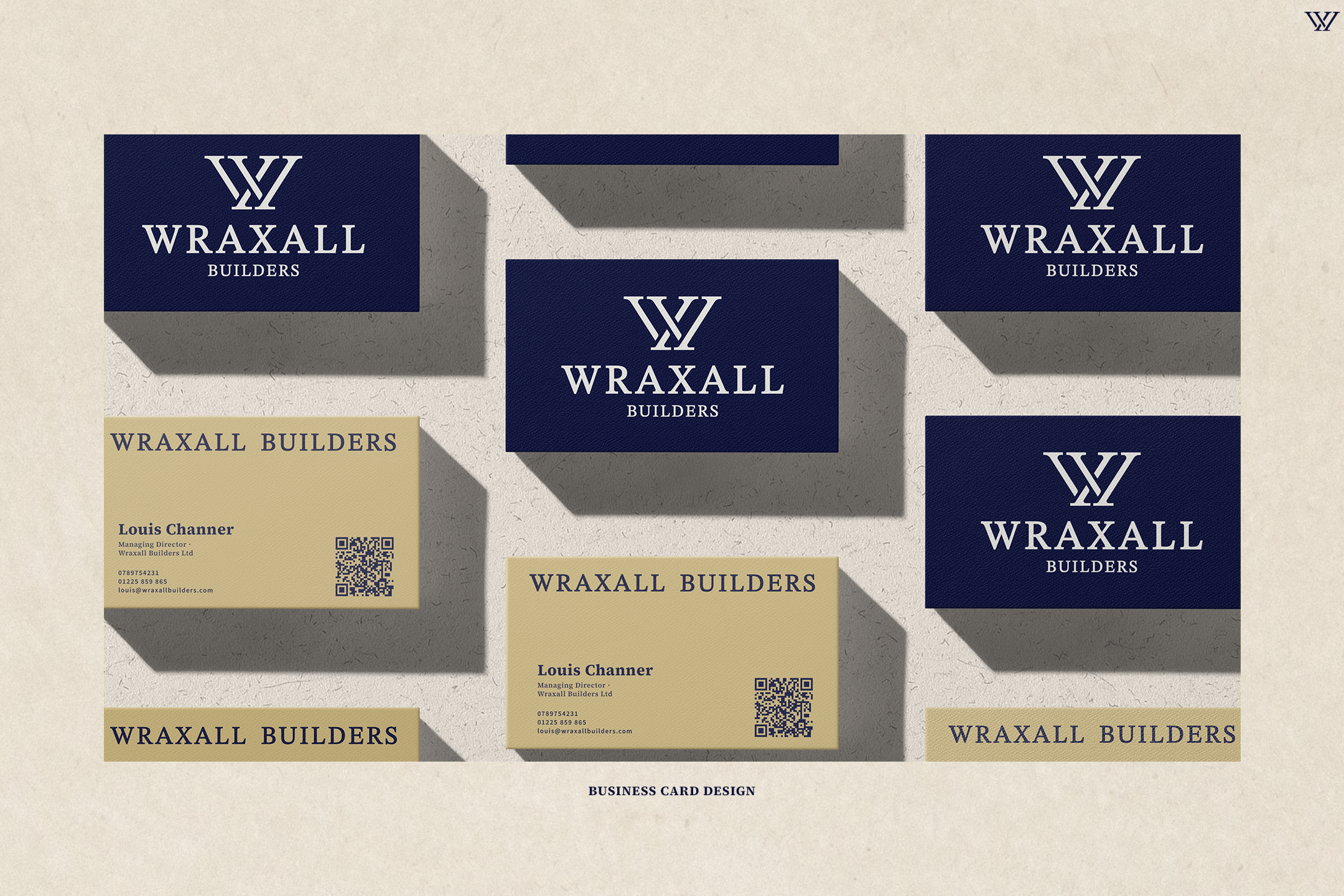
This approach allowed for the creation of a responsive logo system that adapts seamlessly across various formats and scales, from signage and print to digital platforms. The final identity reflects strength, precision, and longevity, reinforcing Wraxall Builders’ position as a trusted, established company while confidently marking its evolution at the 45-year milestone.